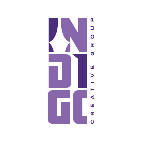
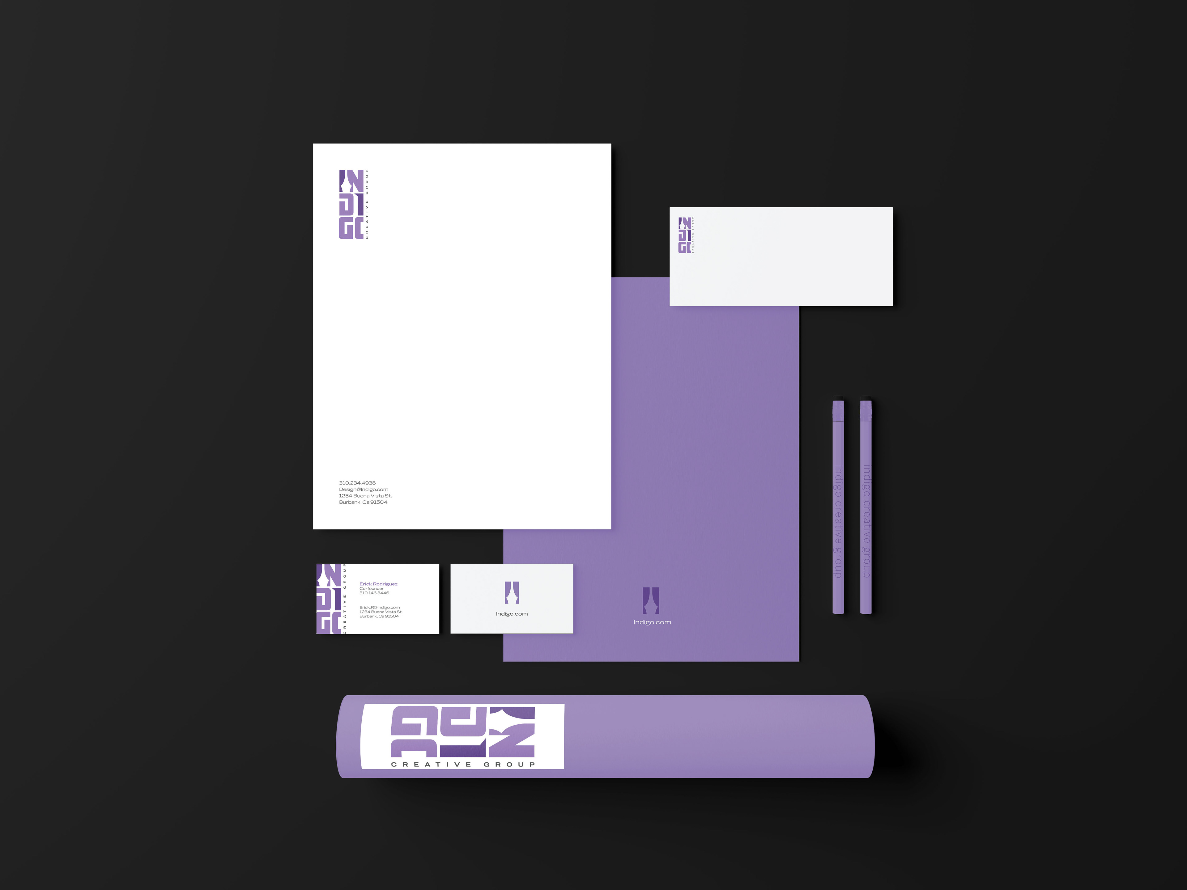
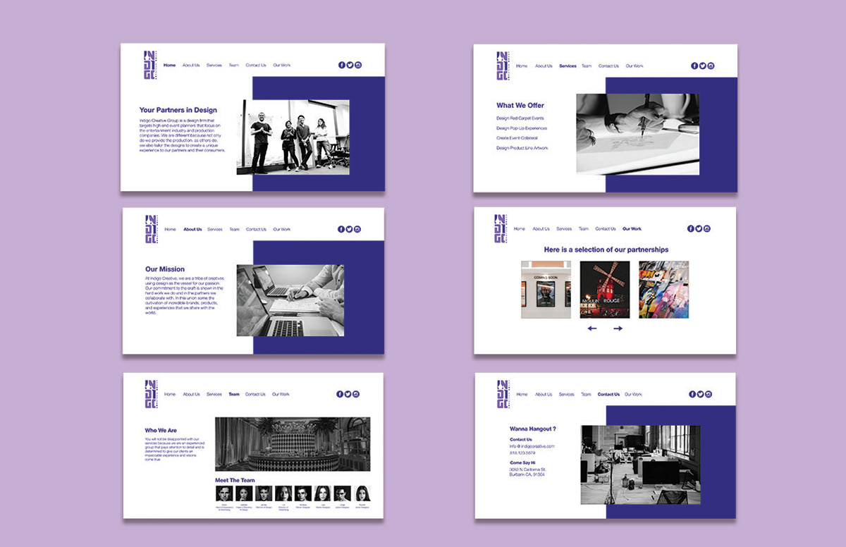
Indigo Creative Group was a design firm that my partner Erick Rodriguez and I came up with targeting event planners for the entertainment industry and merchandising as well as art direction for entertainment apparel. With our branding we wanted to show the professional and welcomeness attitude that we wanted to give our clients, that’s why the I and the N look like open curtains and the second I shows an open door demonstrating that our doors are always open. We went for a bold condensed typeface for the word Indigo and a wide condensed typeface for creative group. We went with a serif typeface to give it a clean and professional look.
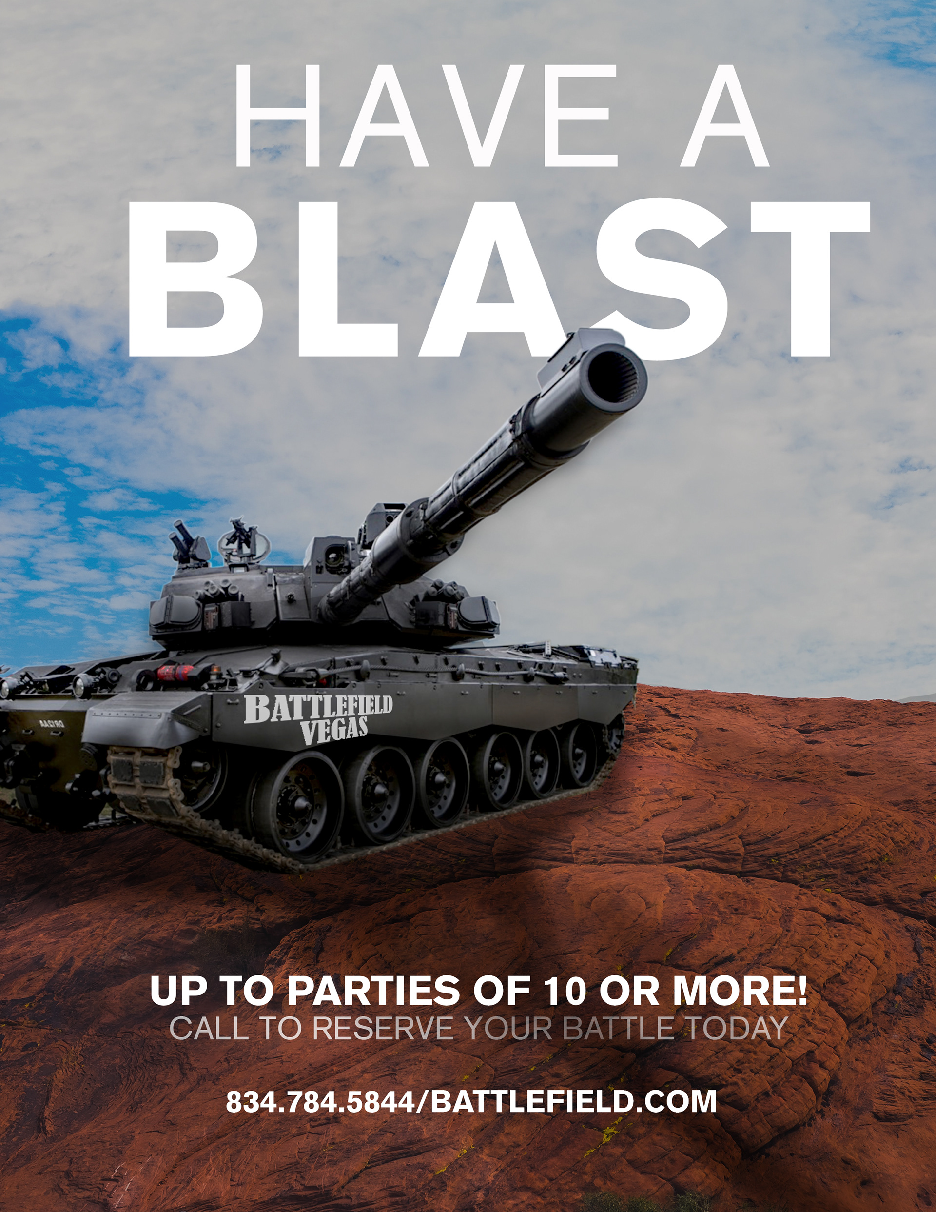
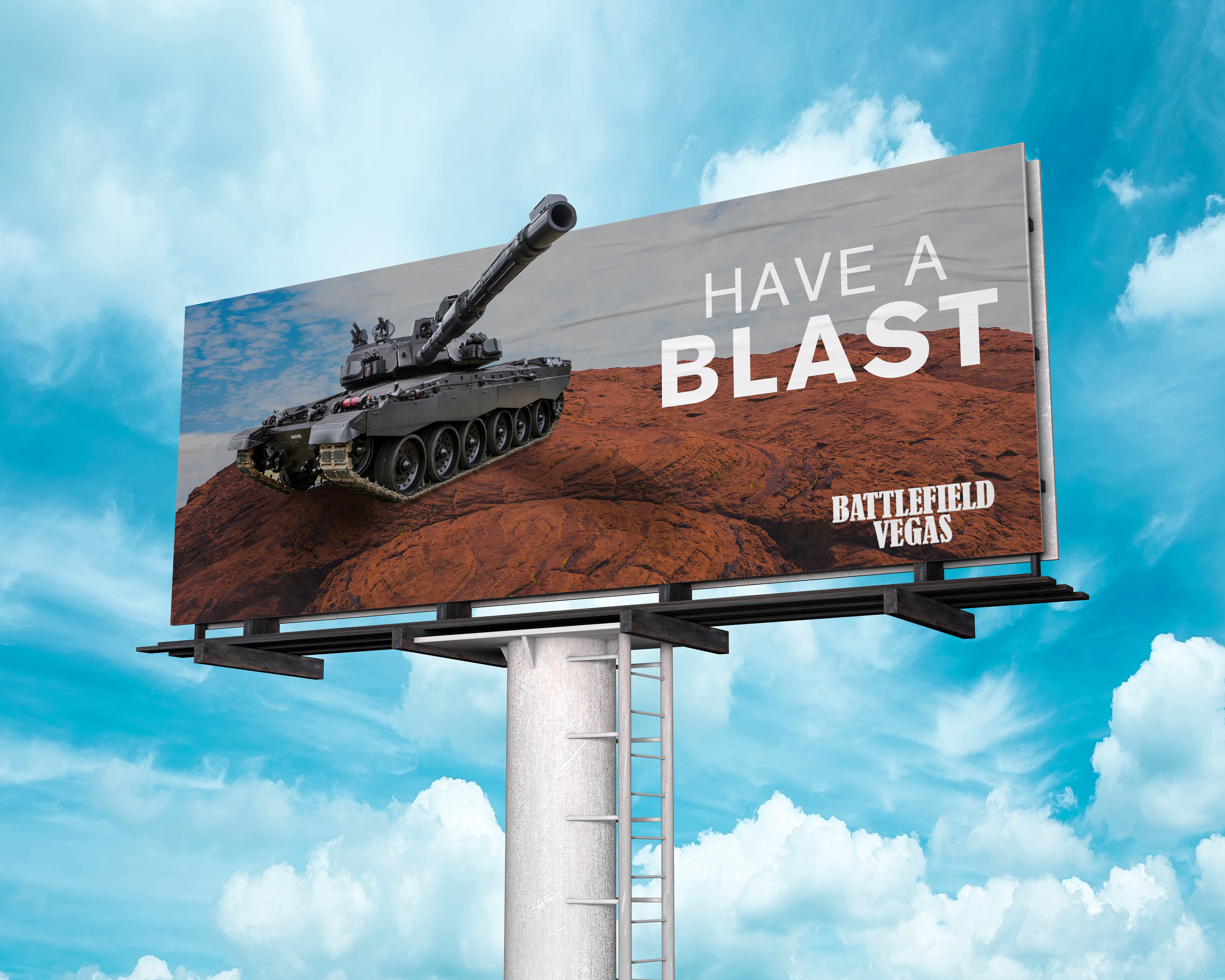
Our client was named HSN and they wanted to emphasize driving tanks on Battlefield Las Vegas. They wanted to focus on the adrenaline rush you get in Las Vegas and the adrenaline you get while driving the tank. The target audience was people who wanted a new experience and people who want an adrenaline rush. We showcased the tank on open mountainous road, to showcase the open space you get while driving the tank around the premises. We went with a bold typeface for the word Blast since it’s the important word. The blast of the tank and having a blast while driving the tank.
